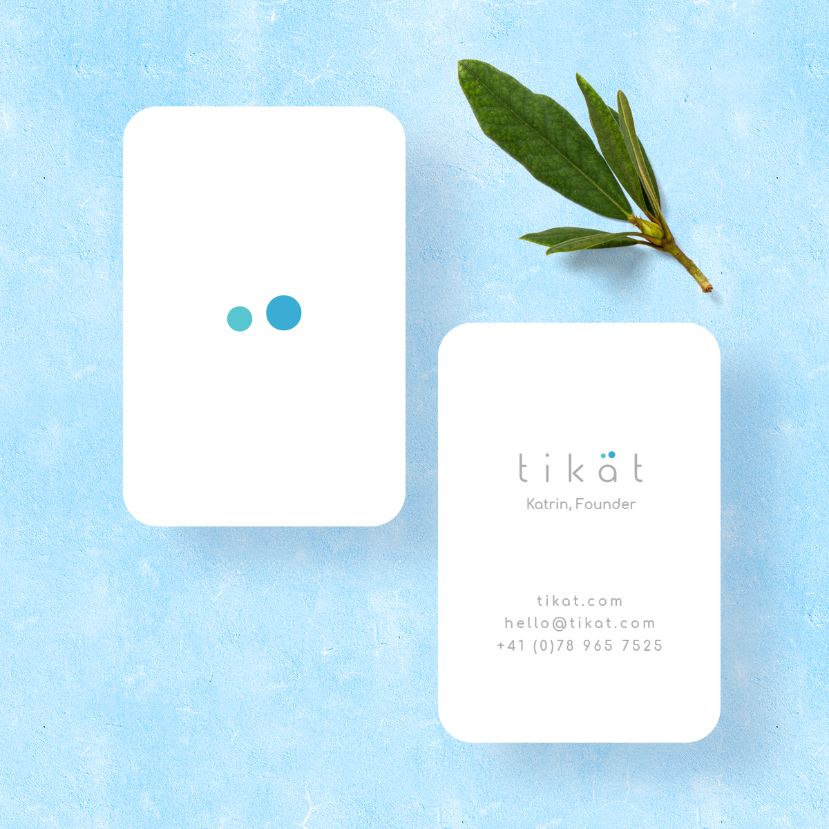
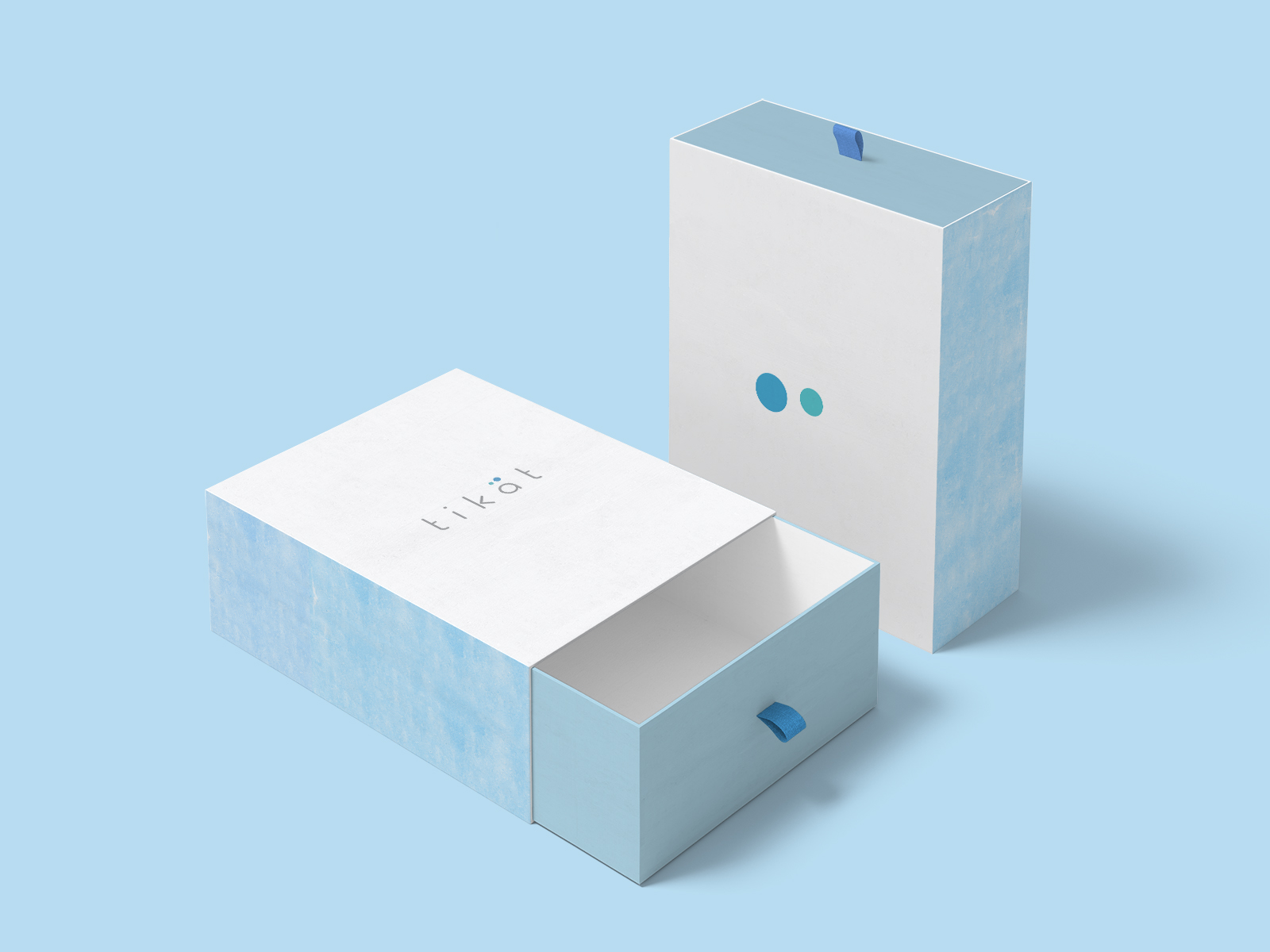
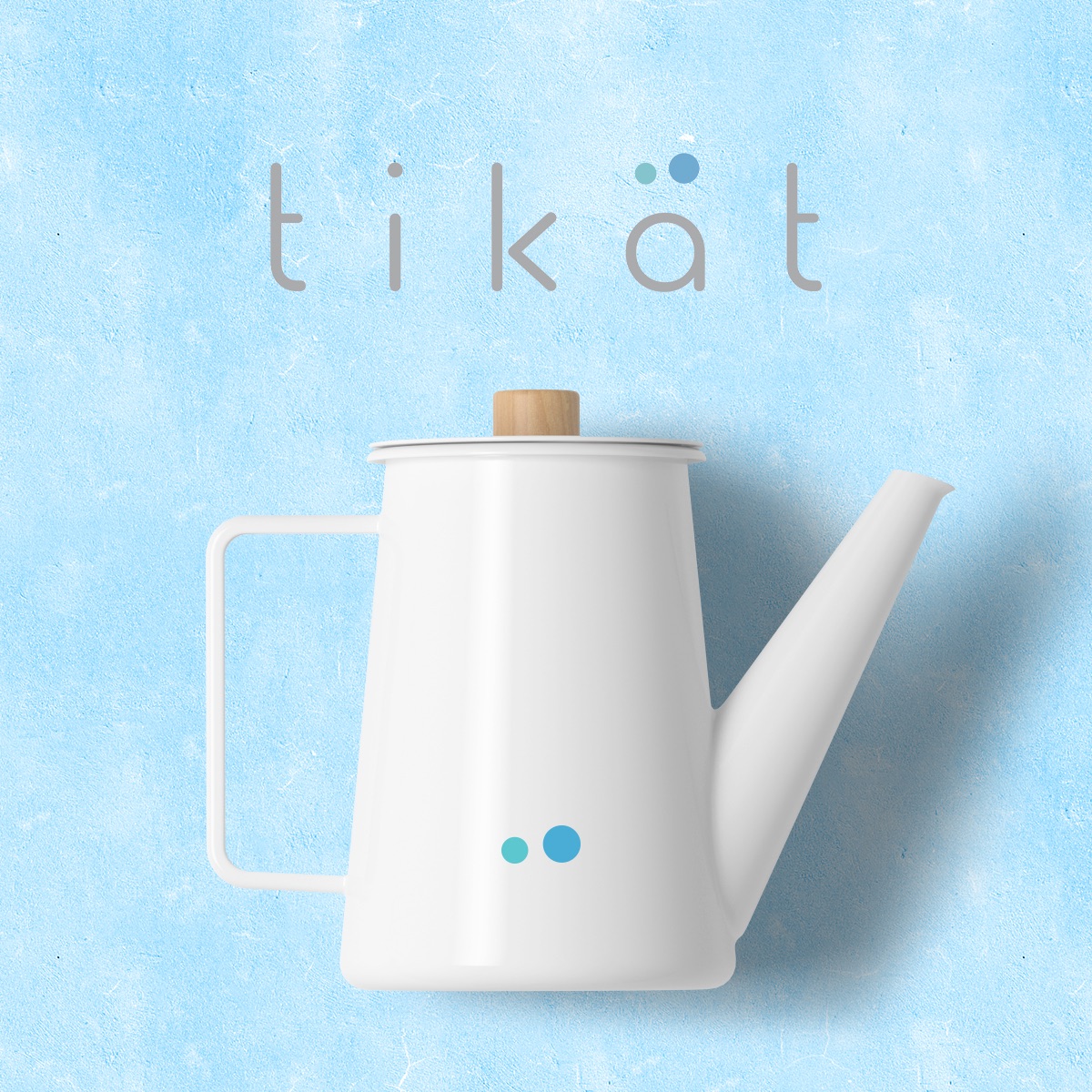
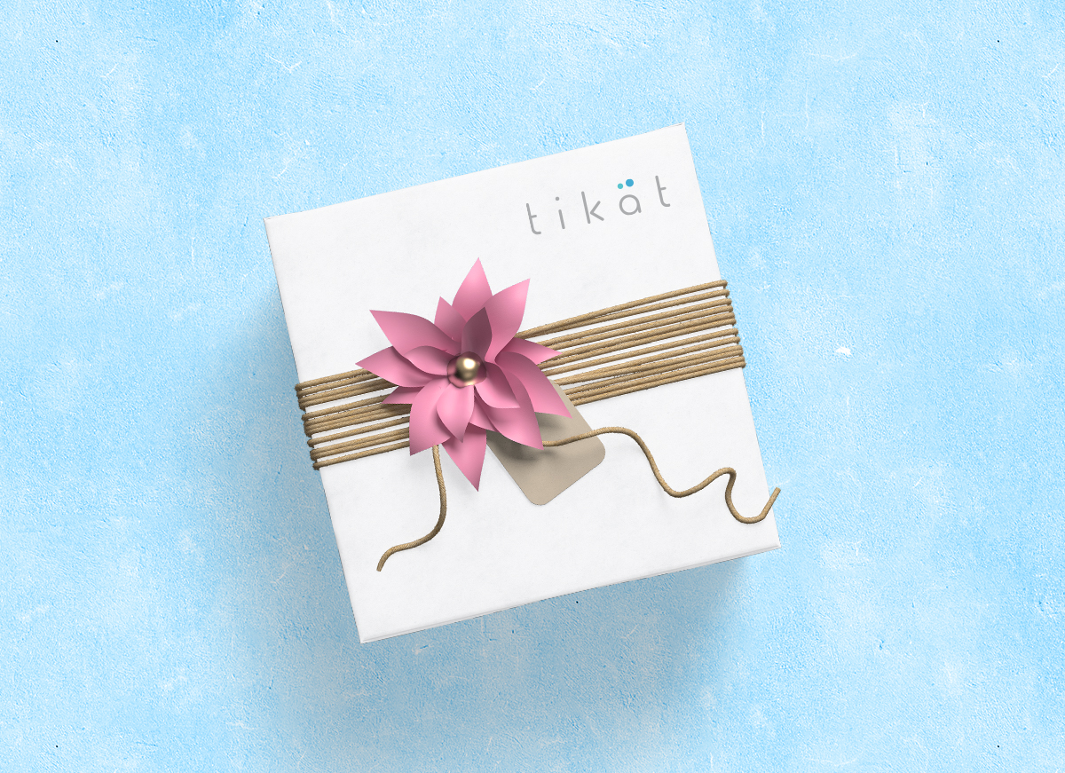
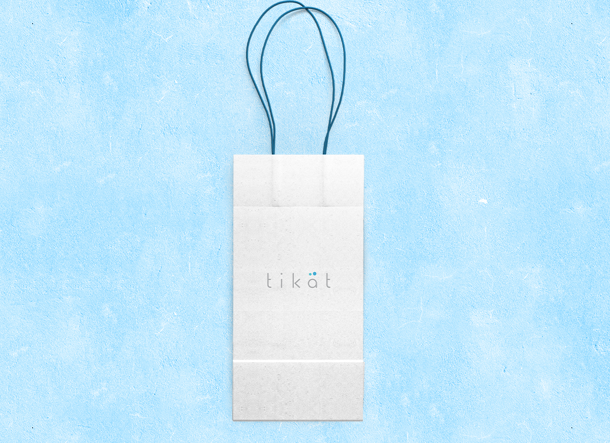
Tikät logo and Brand Identity

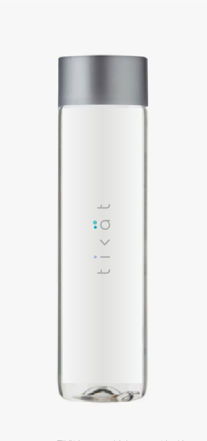
Tikät is a new drink concept looking to bring healthy and tasteful drink alternatives to sugary sodas and artificial beverages to people on the go. The product works with beverage sensory specialists to provide insanely tasteful blends of naturally “free from” plant infusions made of tea leafs, herbs, flowers or dried fruits. Tikät blends are used to prepare a great variety of drinks at cafes – hot, cold or sparkling – with local quality waters.
The target group consists of active, health conscious consumers who want to stay in control of their rehydration needs throughout the day, without ever sacrificing taste variety. They refuel mindfully. On a typical day, they will drop some tikät infusion into their water bottle at home for the way and later get it refilled in the cafe around the corner.
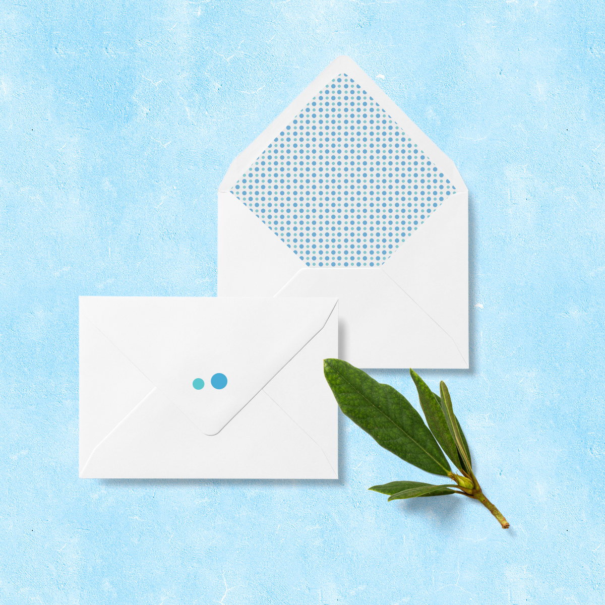
The customer wanted a logo where they can use part of it (or a derivative of it) as an icon as well that would be recognizable as the brand without spelling out “tikät” (e.g. nike + swoosh; Starbucks + Sirena; Apple + apple icon; Mulberry + tree), they wanted to create a clean, nordic look. Best logos are simple.
I noticed an unusual think which the logo had: two dots above “a”. It was a great hint for me, I knew what I have to catch. Also due to theme of the product, which is water, I used 2 dots above “a” as water dots. This way, I created a symbol, which could be used either separately and inside the logo. It was very important for customer. Also I kept a water inspired theme, recognizable and looked great on their production.
Date:
December 7, 2019