Freelance work with havrykdesign is easy
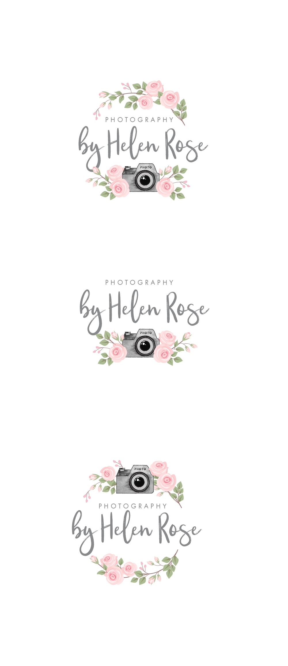
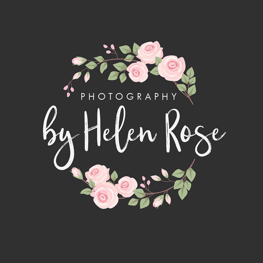
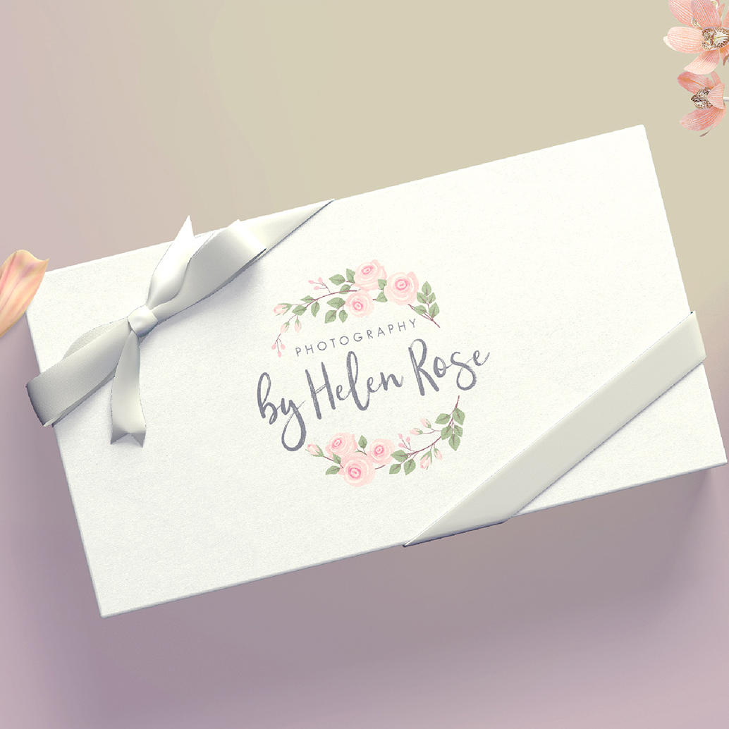
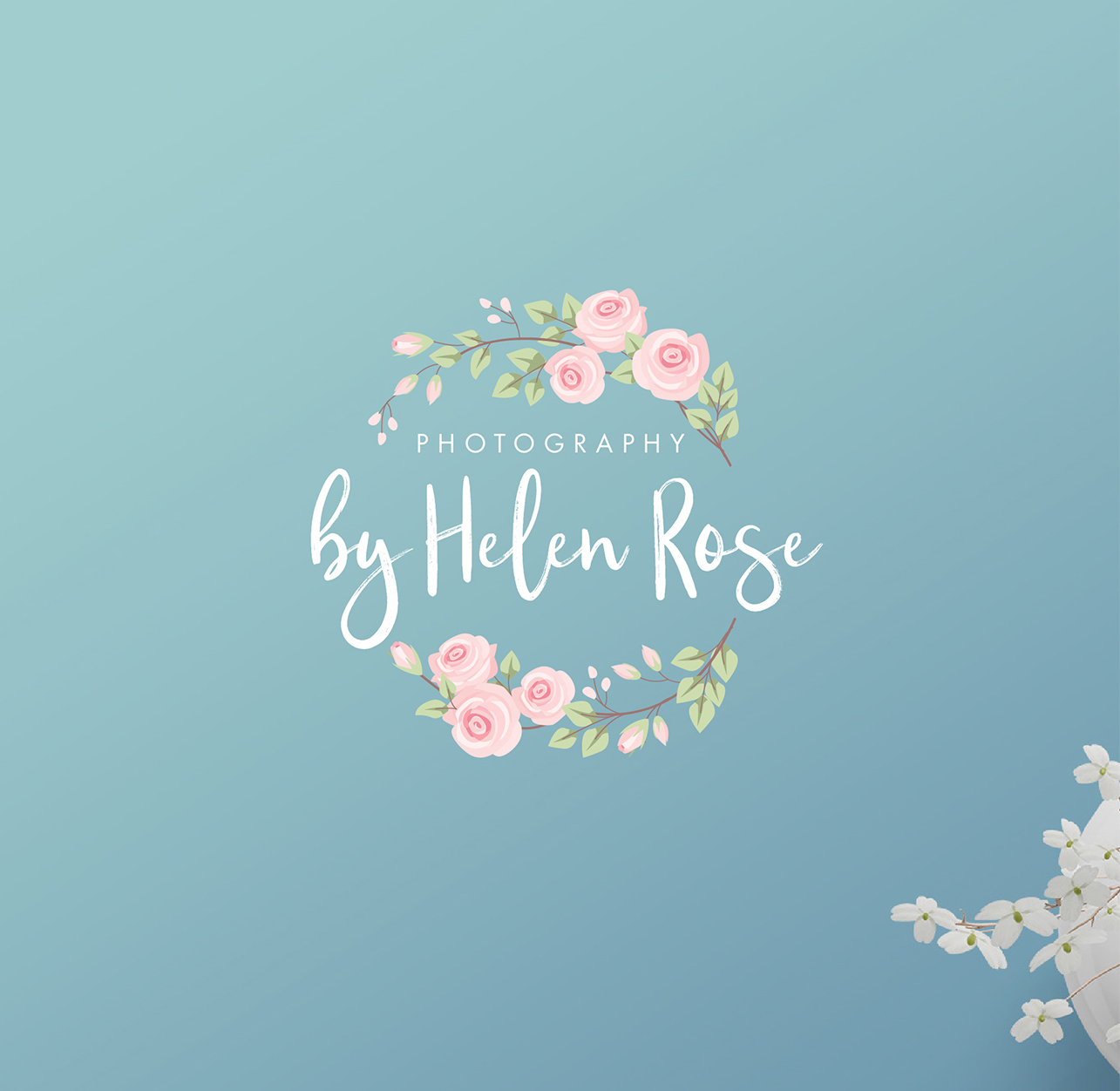
Rose watercolour effect logo
The vital questions which I had to ask before the logo development:
- Who is the user
- Who is the customer
- Who are the competitors
So, what we had
- The user: family people, wide age range, conventionalists, income is average and higher
- The customer: a young woman, a typical member of her target audience, a photographer. The portfolio includes mainly cheerful images. The mood is calm and harmonious.
- Competitors: the client lives in a small picturesque area, competition is low. The main influence sphere is word-of-mouth. This, by the way, can be used to her great advantage.
- Users awareness. The logo is planned to be promoted by social networking, invites, letters, brochures and local ads.
Conclusions: the logo should be traditional and calm. It should communicate a natural and picturesque message. The logo should look great both on polygraphy production and on social covers. The most notable thing which has to catch one’s eye is the client’s name, Oudry Rose. Having analyzed the target audience, we came up with two possible options. One would depict 2 rose branches and the other one, a camera among the roses. This way we are capable to make the logo more personalized; thus more recognizable
Date:
October 27, 2019