Hihihome
Hihi (pronounced he-he) means a gleaming ray of light/sunlight in Maori.
They are targeting fun, stylish people aged 25+, who like great design and quality, without stuffiness. They like timeless pieces that are still fresh and fashionable.
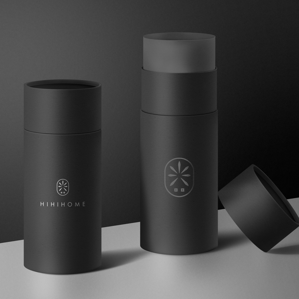
The logo was going to be on packaging, as well as sewn onto each of our products individually, so needed to be clear & simple.
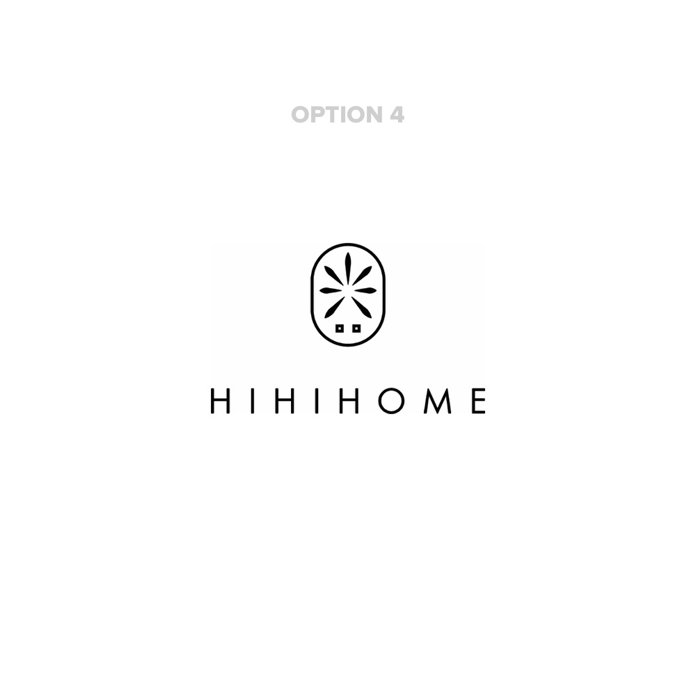
They wanted to have a pretty sleek/minimal logo that included the word Hihihome, along with an abstract little picture that somehow incorporated sun/ sunlight/ray of light etc. Just a really beautiful, luxurious looking word with an abstract little pic above or to the left of the word, which linked in with the meaning of the word.
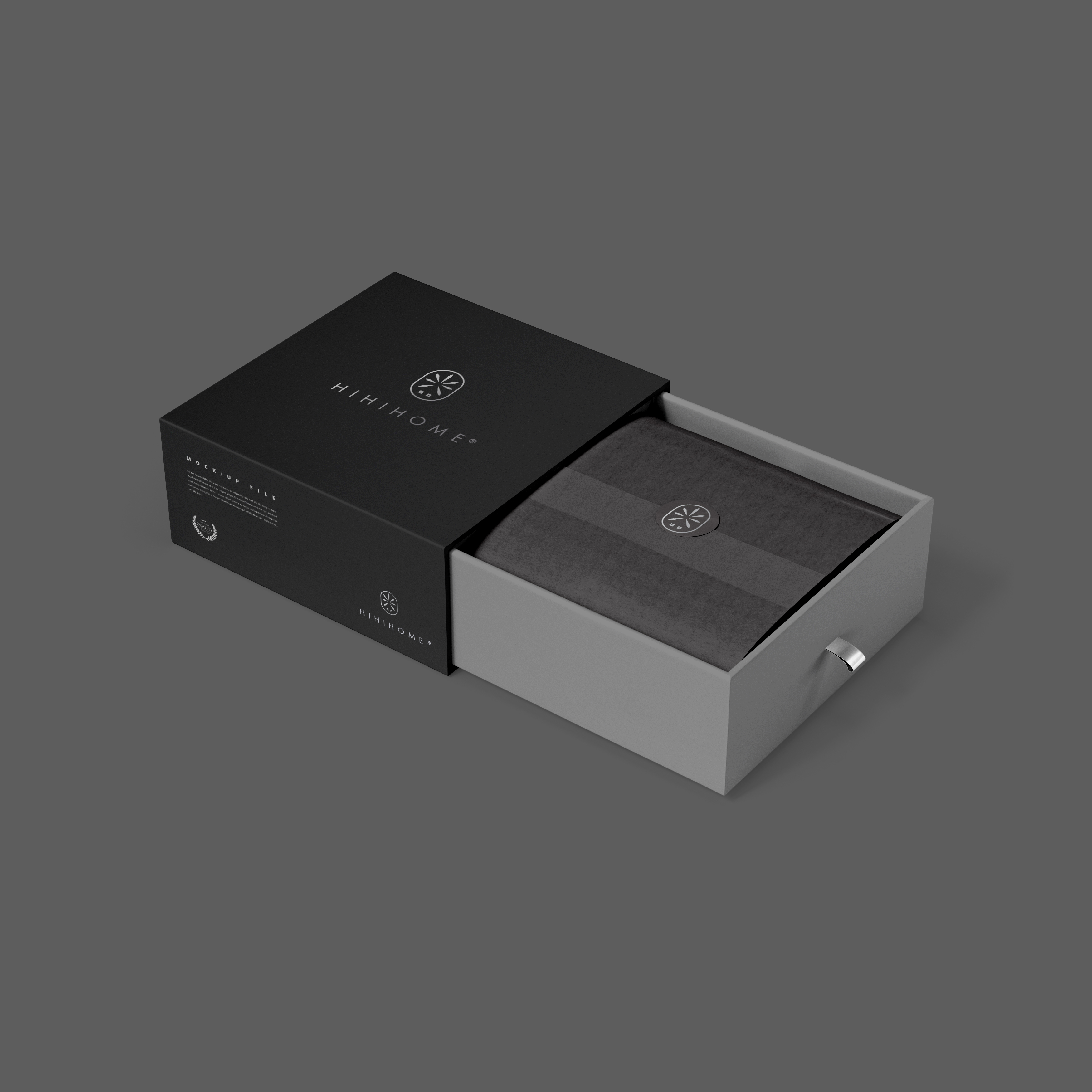
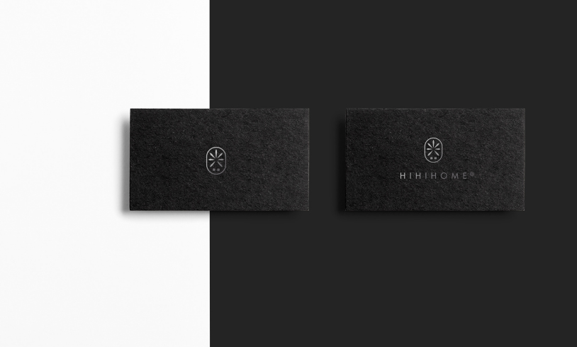
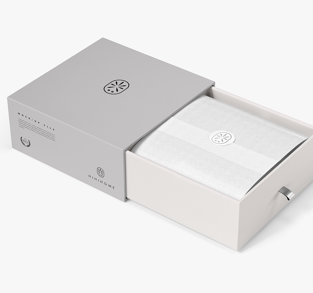
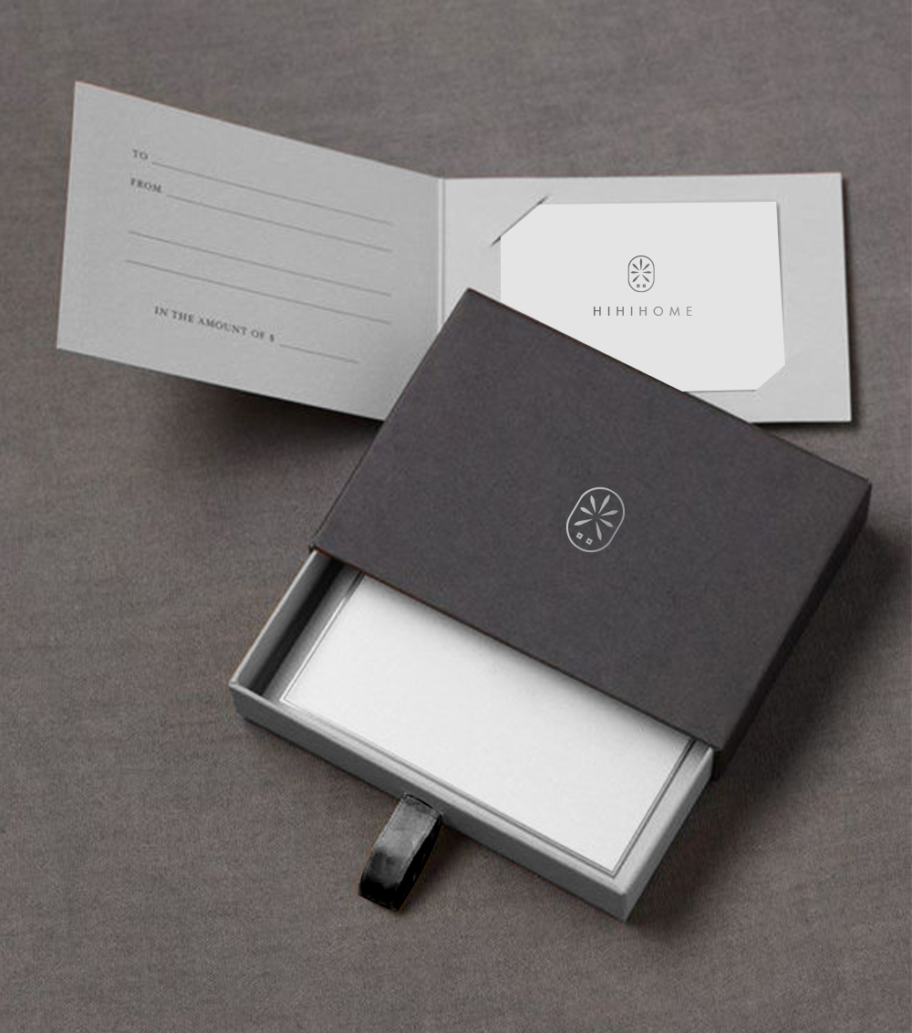
I provided 4 options for them. I aimed to show the sun in its unusual way; at the same time, to keep a sophisticated and minimalistic feeling. The fourth option won over and I made several products in a style demonstrated above.
Date:
November 2, 2019

