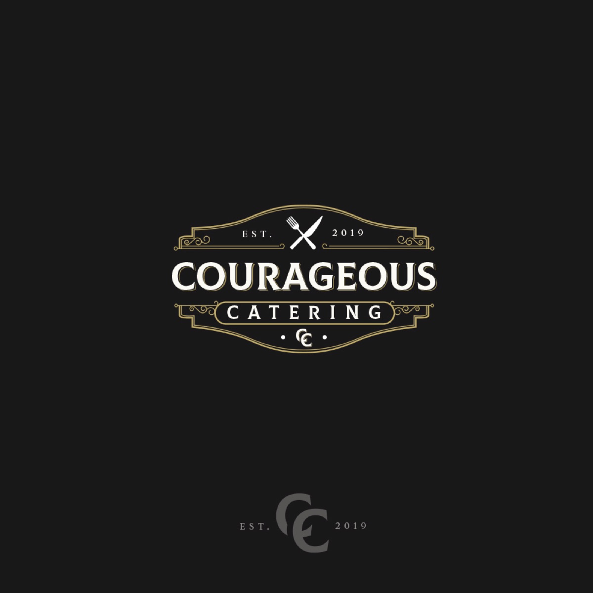
Courageous Catering logo
The company prepares and delivers artisan foods to businesses and homes all over the city. They are a catering business focused initially on baked goods, but also spreading further to cover meals and party catering. All foods are hand prepared and cooked by them.
They needed a strong vintage style logo. They were leaning towards the vintage/classic style of logo as it blends with who they are.
In the logo, I reflected both, the short name of the company (CC) and a food symbol (fork and spoon). I knew that it was a good advantage of the logo, because first, it showed what the brand is. Second, they had a short symbol, which could be used separately and there was no need to keep a multi-element logo for all cases.
They liked in on the first try. So I got to make all package production for them.
Date:
November 30, 2019


